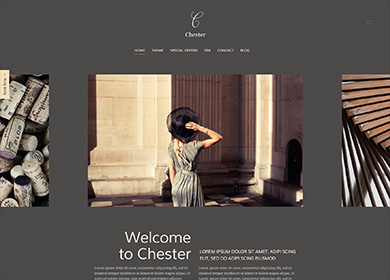
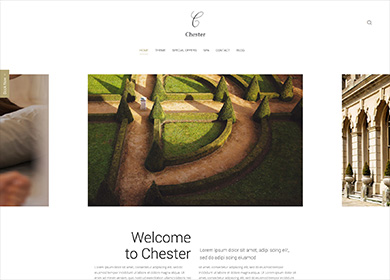
Theme Features

This theme is built on the Warp framework, a well-engineered theme framework for WordPress and Joomla, and utilizes all of its latest features. The user interface is powered by UIkit, a lightweight and modular front-end framework, which provides the theme's styling. The theme also comes with a wide range of different layouts and widget variations.

Navigation Settings

Navigation Settings

The navigation comes with two different layouts. It can be centered with the logo stacked above the navbar. Alternatively the logo and navigation can be displayed in a single row. Additionally, you can apply a sticky navigation, so it remains at the top of the viewport when scrolling.
Article Style

Article Style

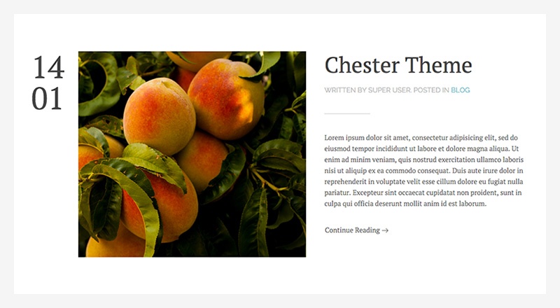
Chester theme comes with an optional alternative blog layout. It displays the featured image and the article content side by side with a special styling for the create date. The default blog layout is also still available.
Position Appearance

Position Appearance

To give you more flexibility, Chester theme provides a number of settings for each widget position. You apply different background colors, paddings, block widths and place a divider between blocks. Each style features a different divider.

Background Colors
Default, Muted, Primary, Secondary
Available Widths
Default, Small, Full width
Padding
None, Default, Large
Divider
Checkbox (true or false)
Sidepanel Position

Sidepanel Position

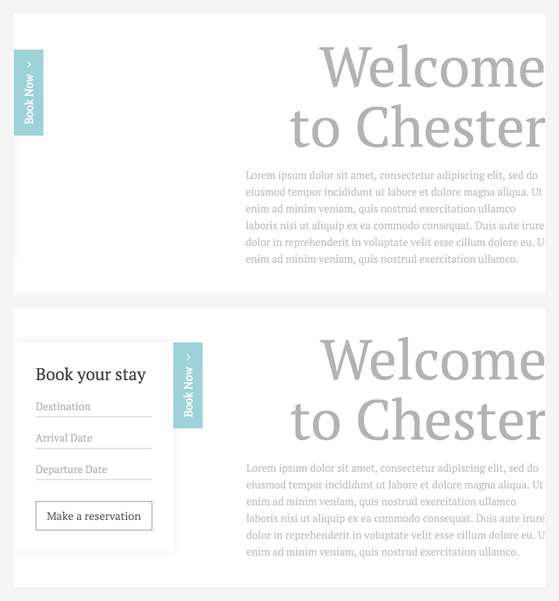
Sometimes you want to have content handy at all times. That’s why we’ve added the Sidepanel position to this theme.

A button that remains fixed on the left side of the browser window toggles any content that is published inside this position, so it will slide into view.

Widgetkit

Chester Theme features Widgetkit 2, our content creator toolkit. In addition to the default widgets we also created four custom plugins which perfectly fit the theme's overall styling: a special Slider, Popover and two Switcher widgets.

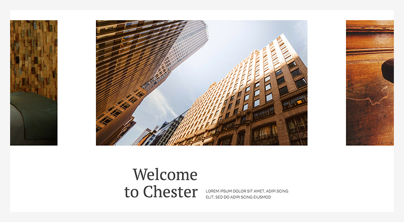
Slider Chester

Slider Chester

This custom Slider provides a special layout. The active item will always be centered and has plenty of space to its adjacent items, so that they appear cut off by the browser window. This results in an elegant and trendy tripartite setup.
Popover Chester

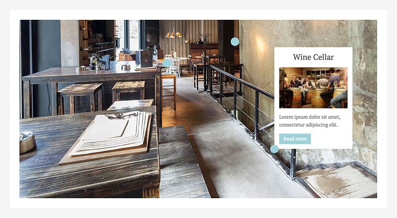
Popover Chester

The Popover Chester widget comes with a custom toggle icon and alignment options.

Available Alignments
Left Top, Right Top, Left, Right, Left Bottom, Right Bottom
Switcher Chester

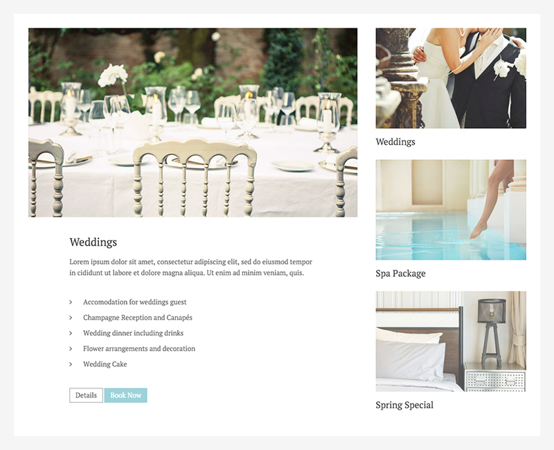
Switcher Chester

The Switcher Chester makes particular use of the thumbnav. You can display the item’s title under its thumbnail. We recommend placing the content and thumbnav side by side and use a second image for the thumbnail as seen on the frontpage.

Additional Settings

Content Width
100%, 90%, 85%, 80%, 75%, 66%
Media Tab, not available when media is aligned left or right
Switcher Chester Nav

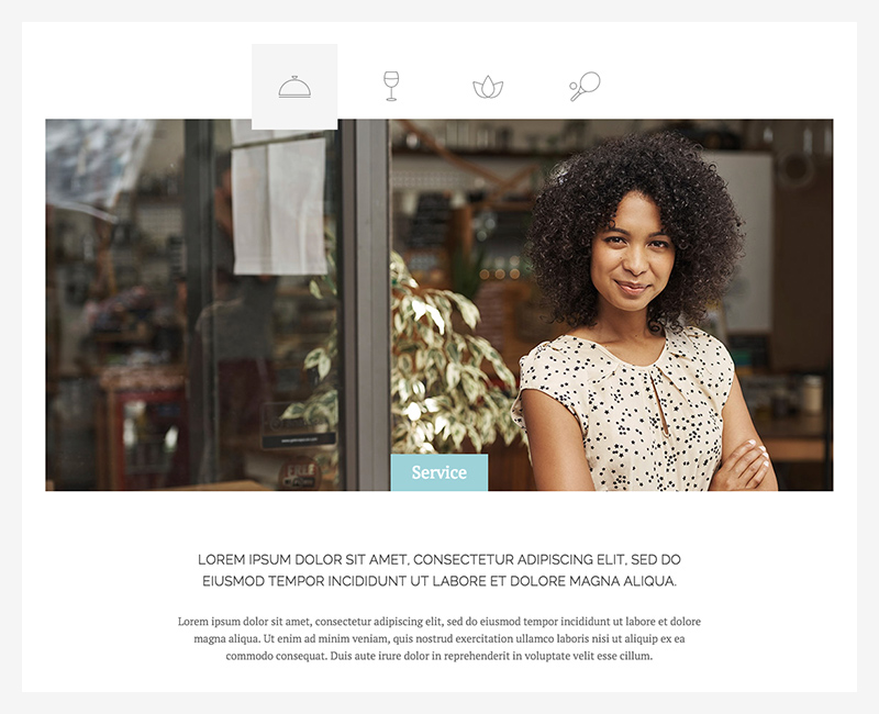
Switcher Chester Nav

The second custom Switcher in this theme features a special navigation. You can use an image, like an icon, the item’s title or both to navigate trough your content.

Additional Settings

Navigation
Icon, Title, Icon and title
Position
Top, Bottom, Left, Right
Content Width
100%, 90%, 85%, 80%, 75%, 66%
Media Tab, not available when media is aligned left or right

Styles

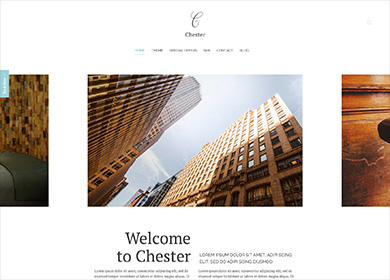
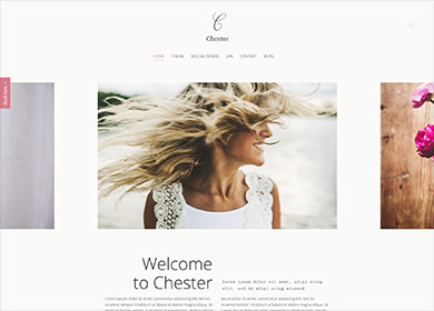
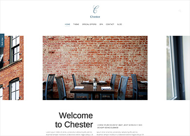
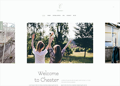
We provide lovingly crafted style variations to give you a glimpse of what is possible with this theme. The built-in theme customizer allows you to modify colors, fonts, sizes and much more without any CSS knowledge. Just choose your colors with the color picker and adjust the theme with only a few clicks. Click on one of the images to see the style.
Default

Default

Rose

Rose

Dove

Dove

Moss

Moss

Dark

Dark

Gold

Gold

Custom Classes

Avion includes a number of custom classes that extend the functionality of UIkit and Warp or help customize the styling of certain Widgetkit plugins. This table gives you an overview of the purpose of each of these classes.

Class Description
.tm-alt-font Add this class to a text element to apply and alternative font family and text transform. Both can be set in the customizer.
.tm-blockquote Add this class to a <blockquote> element to apply a special styling as seen on the Contact page.
.tm-panel-subtitle Add this class to a <p> element to apply the same styling as an article's subtitle or article lead.
.tm-price, .tm-sup Add this class to a container element, to create a pricing list as seen on the frontpage. Use a <h4> and a <sup> element with the .tm-sup class for the price itself.
.tm-list-line-dotted
.tm-list-line-dotted-space
Create a list as seen on the Spa page by adding the first class to an <ul> and the second one to a <span> element inside the list items.
.tm-list-angle Create a list with angle icons as bullet points.
.tm-margin-large
.tm-margin-large-top
.tm-margin-large-bottom
Add large top and/or bottom margin to elements.

Warp Framework

A fast and slick theme framework which is built on the latest web techniques like HTML5, CSS3 and PHP 5.3+

Visit Website

UIkit

A lightweight and modular front-end framework for developing fast and powerful web interfaces.

Visit Website

This theme is available for JoomlaJoomla and WordpressWordPress including the same features on each system.